ContextRail has a reputation problem
Convincing a company to move its shipping from road to rail is a hard sell. Rail is cheaper and cleaner, but it has a reputation: opaque, slow to communicate, hard to track. Fix that reputation, and the business case makes itself.
That was the challenge Lineas brought to the table. As Europe's largest private rail freight operator, they had the network. However, what they needed was the digital experience to match it. Operations were running on legacy systems, spreadsheets, and email chains. Customers had no visibility into their orders. Delays went unexplained.
OutcomeFrom 2.5 to 4.1
Over two years, I led design across three connected platforms serving engineers, operations teams, service providers, and customers.
Three months after launch, customer satisfaction score jumped from 2.5 to 4.1. The driver was straightforward: for the first time, customers could see exactly where their shipment was, what was causing a delay, and what was being done about it. Transparency, it turns out, is a competitive advantage.
My roleOne designer, three platforms, two years
I was responsible for the product experience across the three platforms, from early problem framing and feature definition through interaction design, validation and implementation.
I came in as lead product designer, sitting between the client, the delivery team, and design. That meant being in the room when product direction was being shaped, not just when screens needed drawing.
| Responsibility | What it meant in practice |
|---|---|
| Product direction | Helped define features and roadmap alongside the client |
| Architecture | Modelled Lineas's operational structure and user flows |
| Design | Designed core platform experiences and expanded the design system |
| Team | Supervised a junior designer, wrote feature briefings |
| Delivery | Documented user stories and supported implementation |
Key ChallengesThree towers, one truth
Lineas organized the solution around three connected platforms, each serving a distinct layer of the business:
| Control Tower | Who it serves | Core purpose |
|---|---|---|
| Customer Care | Support agents + customers | Track & trace, proactive delay notifications, self-service portal |
| Supply Chain | Lineas operations + service providers | Plan and monitor logistics across multi-partner ecosystems |
| Product & Network | Engineers and planners | Master data for locations, products, services, routes and pricing |
The three towers shared a data layer: what engineers built in Product & Network became the foundation that Supply Chain operated on, and what Supply Chain executed became visible to customers through Customer Care. Breaking one would break all three.
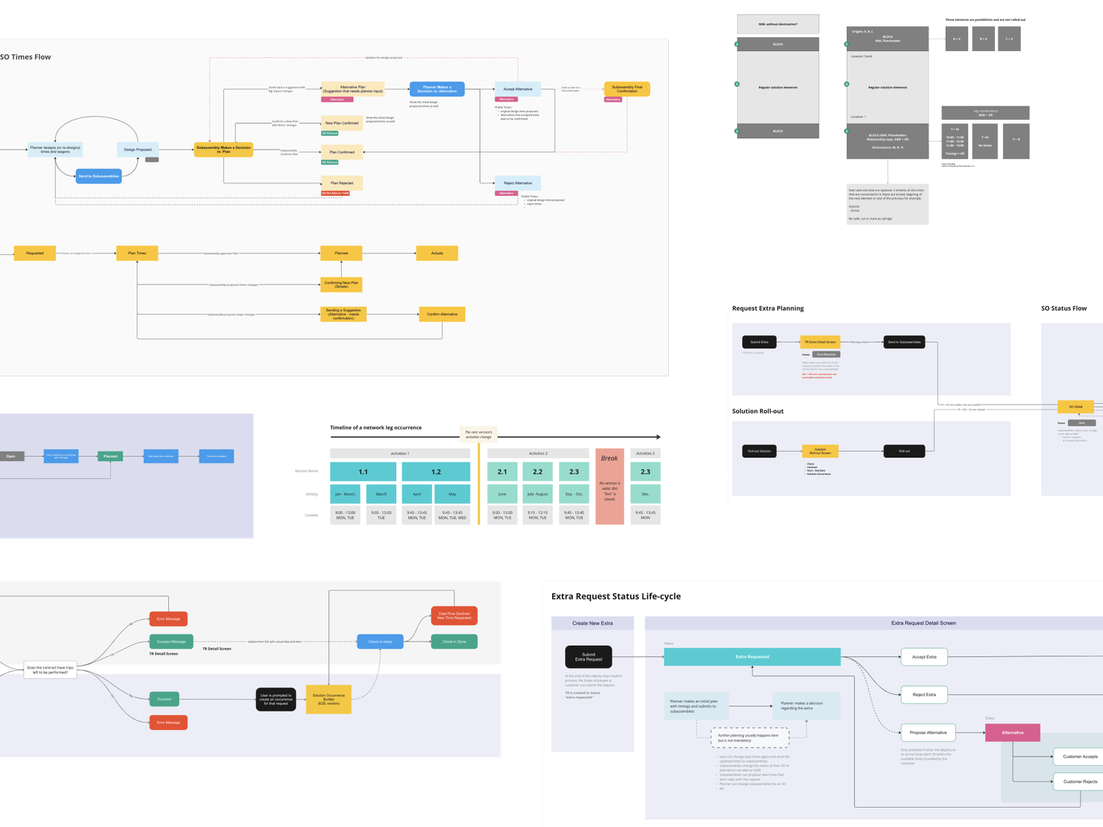
Each role needed a different view of the same data, with different permissions and priorities — and they all needed to talk to each other.
The hardest design problems weren't the screens. They were the dependencies. I mapped all of this early using flow diagrams, getting the complexity on paper before anyone touched a component.
DesignMaking complexity feel familiar
Over two years and hundreds of sprint deliveries, three platforms took shape. The features themselves were complex but the more interesting challenge was finding the right mental models to make that complexity feel familiar.
Versioning: when one route becomes five
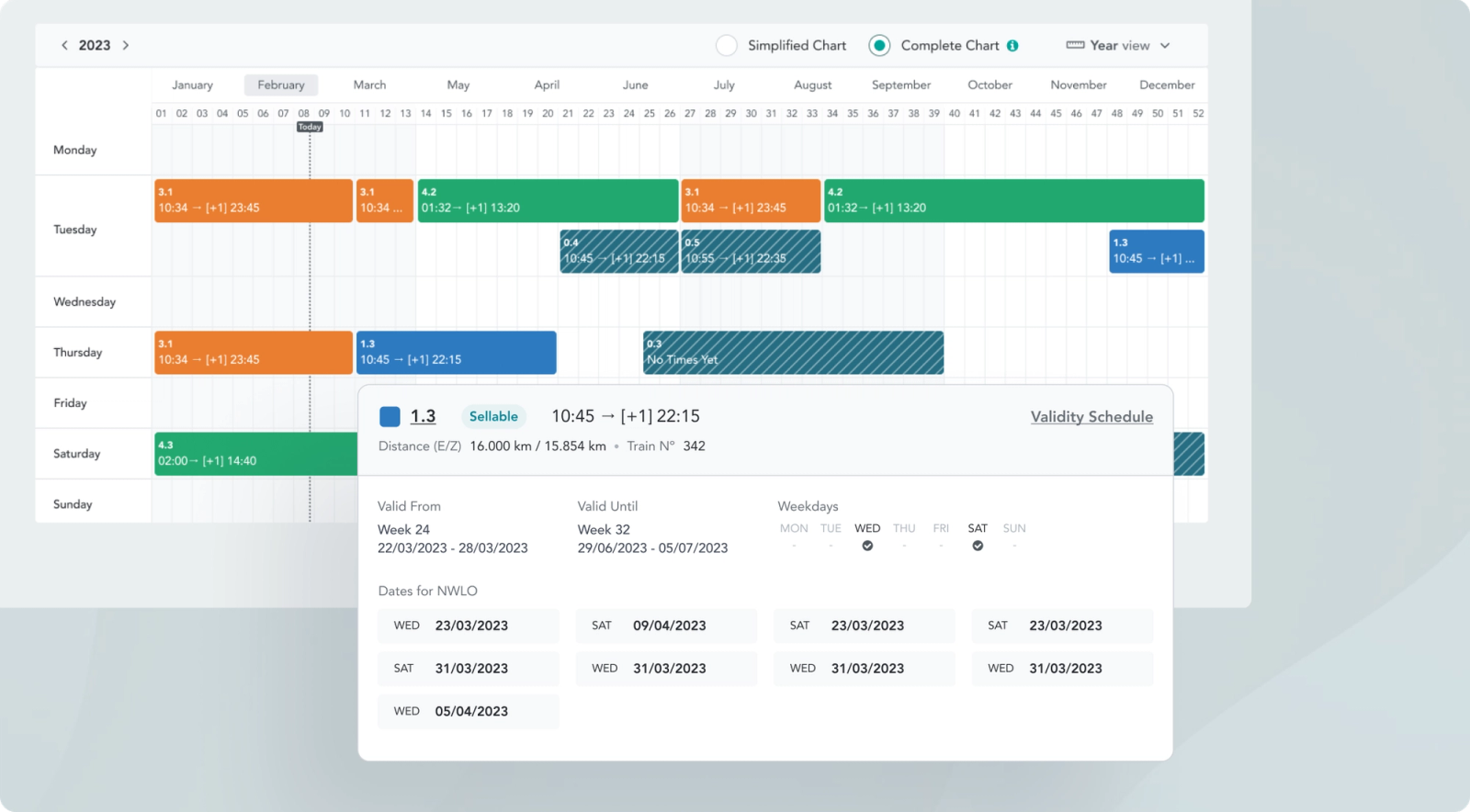
The Product & Network tower needed to let engineers manage multiple versions of the same route running simultaneously, each with its own validity window, weekday pattern, and schedule. A list view would have been unreadable.
Instead, I designed it as a yearly calendar grid: rows for each day of the week, columns for each week of the year, with coloured blocks representing each route version. Engineers could see at a glance which version ran when, where versions overlapped, and where gaps existed. Clicking a block surfaces its full validity schedule inline (no page navigation, no context loss).
What route planning could learn from video editing
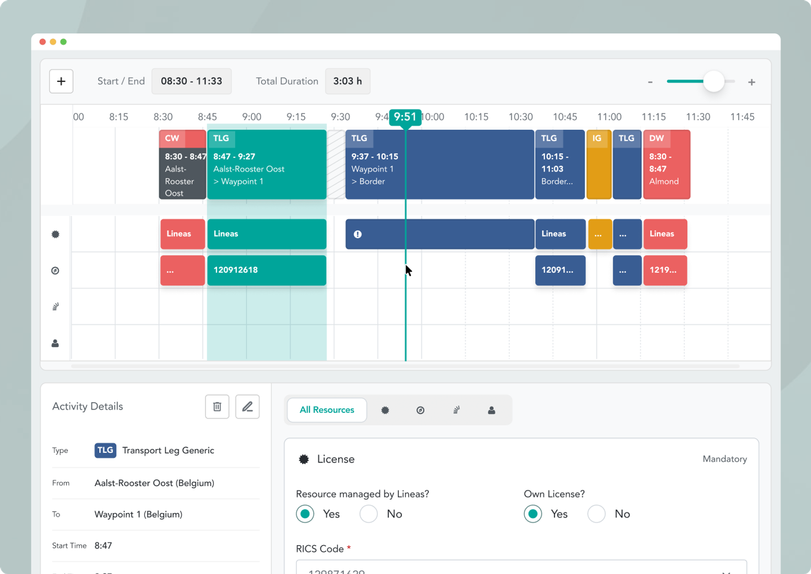
Building a train route means assembling a sequence of legs and services, each with its own set of resources: traction type, driver, license, rail path, wagon. The structure maps almost perfectly to a video editor: a horizontal timeline of segments at the top, with resource tracks running below each one. I used that mental model deliberately.
The result is an interface where engineers can select any segment of a route and immediately see and edit the resources assigned to it in a detail panel below, without losing sight of the full journey. It's a pattern people already understand, applied to a domain where nothing like it existed before.
Seeing the whole journey at once
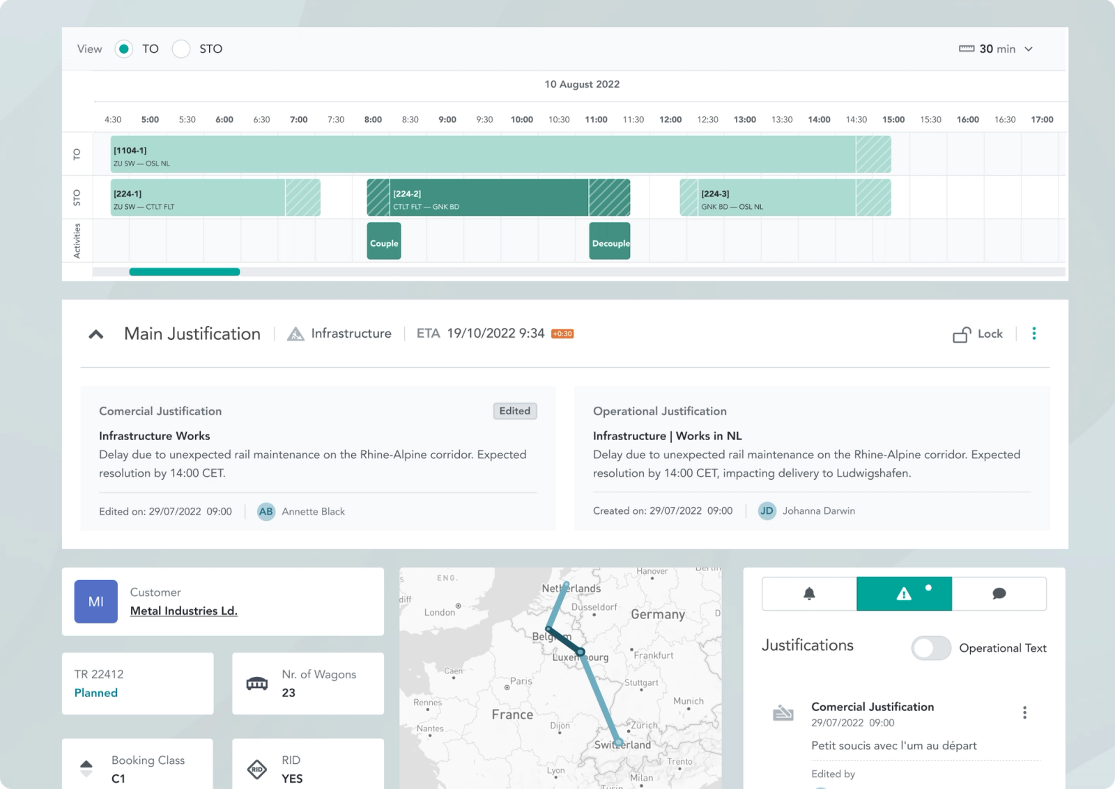
For transport operations, the challenge wasn't planning, it was visibility during execution. The Supply Chain tower needed to show, at any moment, where a shipment was in its journey, what had already happened, and what was at risk.
I designed the timeline at the top of each transport order as a Gantt-style view: segments colour-coded by status, with delay justifications surfaced directly on the relevant segment rather than buried in a separate log. Below it, the full order detail: live map position, wagon-level delivery breakdown, departure and arrival timestamps.
Building consistency without slowing the product down
All three towers drew from a shared design library that grew alongside the project. Every new requirement, including a new calendar interaction, status state, or permission variant, fed back into it. The library kept all three platforms visually and functionally consistent.
ClosingThe complexity doesn't disappear
After two years working across Lineas, I came away with a different view of what it means to simplify a complex product.
The goal isn't always to remove complexity. Sometimes the complexity is real, and hiding it only makes the product harder to understand. The more useful job is to make the relationships, constraints and consequences visible at the right moment, so people can build a mental model of what is happening and act on it.
That changed how I approach complex products. I now spend less time asking how to make an interface simpler in isolation, and more time asking what the user actually needs to understand, and what the product can do to make that understanding easier.